Main Event: Wrestling Manager
Main Event: Wrestling Manager is a project I’ve been developing as a modern take on wrestling booking and promotion management. While the core systems focus on roster management, finances, and storytelling, a big part of the challenge has been designing a UI that can support all of that without becoming overwhelming.
Wrestling management games tend to lean heavily into dense menus and dated layouts. I wanted something that felt closer to a modern sports broadcast or live production interface, while still being functional at a glance.
Design Direction
The overall UI is built around three key ideas:
Clarity over complexity
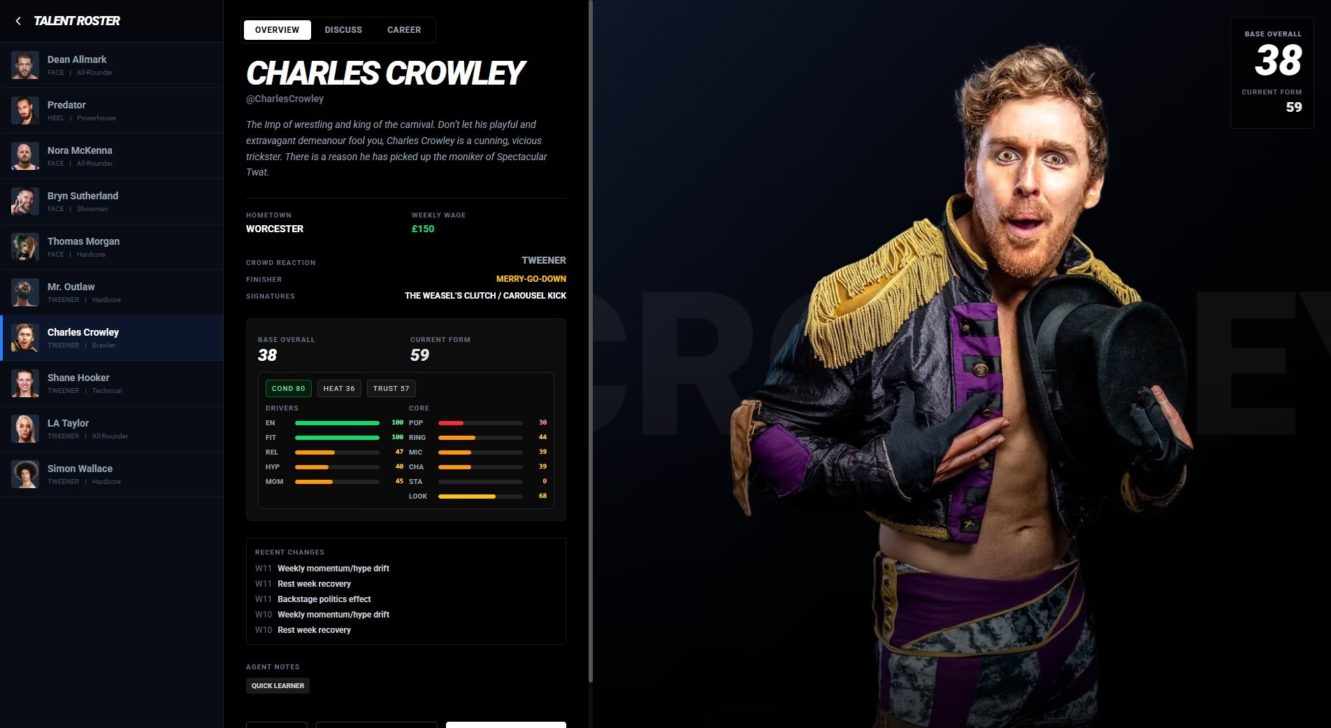
There’s a lot of data in the game, but the player shouldn’t feel buried under it. Information is grouped, prioritised, and surfaced where it’s actually useful, rather than dumped onto one screen.
Character-first presentation
Wrestlers are the product, so they take visual priority. Large renders, strong typography, and clear stat groupings help reinforce that you’re managing people, not just numbers.
A grounded, modern aesthetic
The visual style leans into dark tones, subtle gradients, and colour-coded systems. It borrows from sports graphics and broadcast overlays rather than traditional management sims.
Rather than hiding systems behind layers of menus, everything is accessible within one or two clicks. The goal is to reduce friction and keep the player moving.
There’s still plenty to refine, but the current direction strikes a balance between depth and usability without feeling dated.
Main Event: Wrestling Manager has been a mix of system design and UI problem-solving. The goal isn’t just to make something that works, but something that feels good to use over long sessions.
And ideally, something that doesn’t look like it was built in Excel.